
TMC website redesign
Total Medical Compliance offers products and services to medical offices that help them stay up to date with OSHA and HIPPA requirements.
Scope: Redesign all pages on the website, overhaul navigation and IA, and reorganize the online shop.
My role: UX Designer: conduct stakeholder discovery research, take client through card sorting exercise, analyze results, design wireframes, work with the developer on feasability, and handoff to the visual designer.
Platform: WordPress, WooCommerce
Tools: Adobe XD (wireframing), Lucid Charts (whiteboarding, card sorting)
Our Challenge
How might we educate new users about Total Medical Compliance and its services when they land on the site and then drive them to an easy-to-navigate online store?
Client Goals
This website acts as a business card: Explain the great things about TMC.
This is a sales tool: Drive customers to…
1. Request a quote; become a customer
2. Shop online; buy products/services online
This is a repeat sales tool: Entice existing customers to buy more services in the online shop.
Client Stakeholder concerns:
New and returning customers are coming to this site confused about what TMC offers and they’re overwhelmed by the UI and navigation. It’s important to call out what they offer and then drive them to the online shop for purchase or to reach out for a quote.
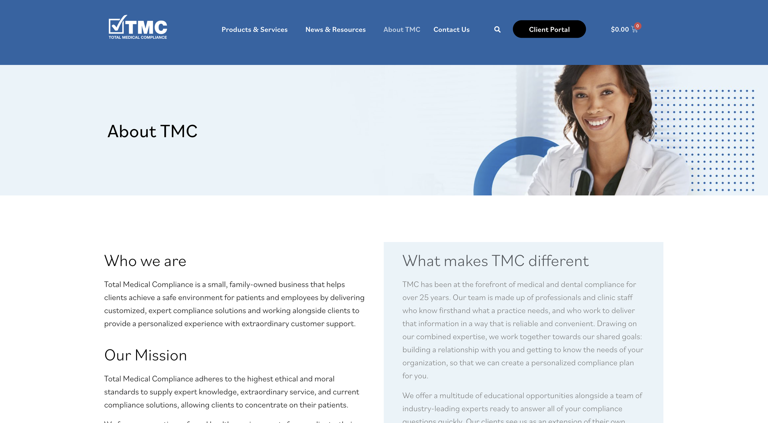
Old homepage

Old menu navigation

Homepage Wireframes
My goal for the homepage was to quickly tell the user about Total Medical Compliance by starting at a high level about the company and highlighting some of the keywords they would be looking for, such as “HIPPA”, “OSHA”, and “Training”. The further down the page gives the user more detail about products and the company. Throughout this journey are opportunities to go to the online shop or read more about products.
Homepage wireframe

Homepage final design

Online Shop Reorganization
The client knew their online shop was cluttered, and even had products they didn’t offer anymore, so I helped them clean it up and rethink how they should be organized.
I created this visual exercise so they could see all of their products and how they were categorized. (Left) I offered some category suggestions to consider. They then took this exercise back to other internal stakeholders to discuss what made the most sense to them and created their own reorganized online shop. (Right.) They went through a couple of iterations before they landed on their final concept.
Initial online shop organization

Client Stakeholder reorganization

Online Shop Wireframes

Online shop
Using the results of the card sorting exercise I designed a navigation that acted as a filter to help the user focus-in on the products they were looking for. If the user was interested in OSHA they would click that and then be shown several sub-categories (Plans, Online Training Courses, etc.) that would act as jump links.
Sub-categories
By narrowing down products to sub-categories, the user can see other related options they may have not considered.
Bundles
Prior to this redesign, product bundles were mixed in with other products, which caused confusion about what was included and made it unclear that there were different tiers of bundles. This design groups them all together and offers a CTA to compare them.