

Podigy is a responsive design podcast platform born from generative research.

Conceptual Agency Brief
Overview
Thanks to an ever-expanding number of devices and screen sizes in use around the world, responsive design is now the global standard for website creation. With this in mind, create a responsive website that solves the problems of real users in the general area of entertainment.
Through the exercise of mind-mapping, two rounds lead us to concentrate on the subject of podcasts. Generative research lead us to create a conceptual podcast platform called Podigy.
Scope: 2.5 weeks, responsive design for desktop and mobile.
My Role: UX Researcher, Designer, Lead for the ideation and design studio phase.
Team: Andy Zheng, Grayson Doub, and Clay Cardozo
Tools: Sketch, InVision
Generative Research
Mind Mapping
Beginning with the general subject of Entertainment, we mind mapped the many industries within that and then narrowed it down to areas of opportunity for improvement. This led us to podcasts, which is rapidly growing yet underserved.

Whiteboard mind-mapping ‘Entertainment’

Continued mind-mapping focusing on ‘Podcasts’
Hypothesis, Assumptions, & Problem Statement
Hypothesis
Podcast listeners need a more centralized way to discover, prioritize and communicate around podcasts, considering the expansion of podcast selections and granularity of topics, as well as the platforms on which you can access them.
Assumptions
Podcast listeners will want to search for and learn about podcasts across multiple listening platforms.
Podcast listeners will want a faster way to understand the quality of podcasts without having to devote their own listening time to do so.
Podcast listeners will want to connect and communicate with others around the topic of podcasts.
Opportunity Space
How can we provide listeners with a way to effortlessly discover podcast content that is appropriate to their circumstances and state of mind, during each listening session?
Podcast Research
Screener Survey & Interviews
Goal: Get a better understanding of how people discover, listen to, and communicate around podcasts.
Our screener survey led us to 15 potential participants, from which we identified 6 ideal candidates and interviewed them about general topics, such as their hobbies, to more narrow questions around their podcast discovery, listening, and communication habits.

Screener Survey responses

Interview responses (click above for full Interview Discussion Guide and notes)
Synthesizing Research
Affinity Map
Categorized comments received from the interviews into individual statements and then organized them into common themes.
Insights from Affinity Map
From the Affinity Map’s “I Statements” we pulled out four big themes around the habits and wants that listeners look for from podcasts.


Ideation
In order to get Podigy up and running as soon as possible we needed to identify the best features and then prioritize them for an MVP. Therefore, we create a MoSCoW Map and a Feature Priority Map.
MoSCoW Map
Insights
The first iteration needs to offer Genres, Current Events, and a variety of categories so users are able to find the type of podcasts that interest them the most.
An on-boarding quiz would be nice, but may be too much effort for the first round.
Podcast Clubs and Editorial Pages are features that could be incorporated further down the line to build a social community.
Feature Prioritization Matrix
Insights
Using a Feature Prioritization Matrix, in-depth insights were gathered into what the process of adding features into the redesign would entail such as:
It’s necessary to allow users to create and save “Listening Profiles” for their various activities and moods.
It’d be nice to have things like Play Controls, Volume, Speed Control, and Progress Bar, and since they are low effort, then we will move them into our MVP.
More complex features like Discussion Forums, Podcast Clubs, and Blogs would be great for community building, but aren’t worth the time and effort for the initial rollout of the website.
Design Process
Design Studio
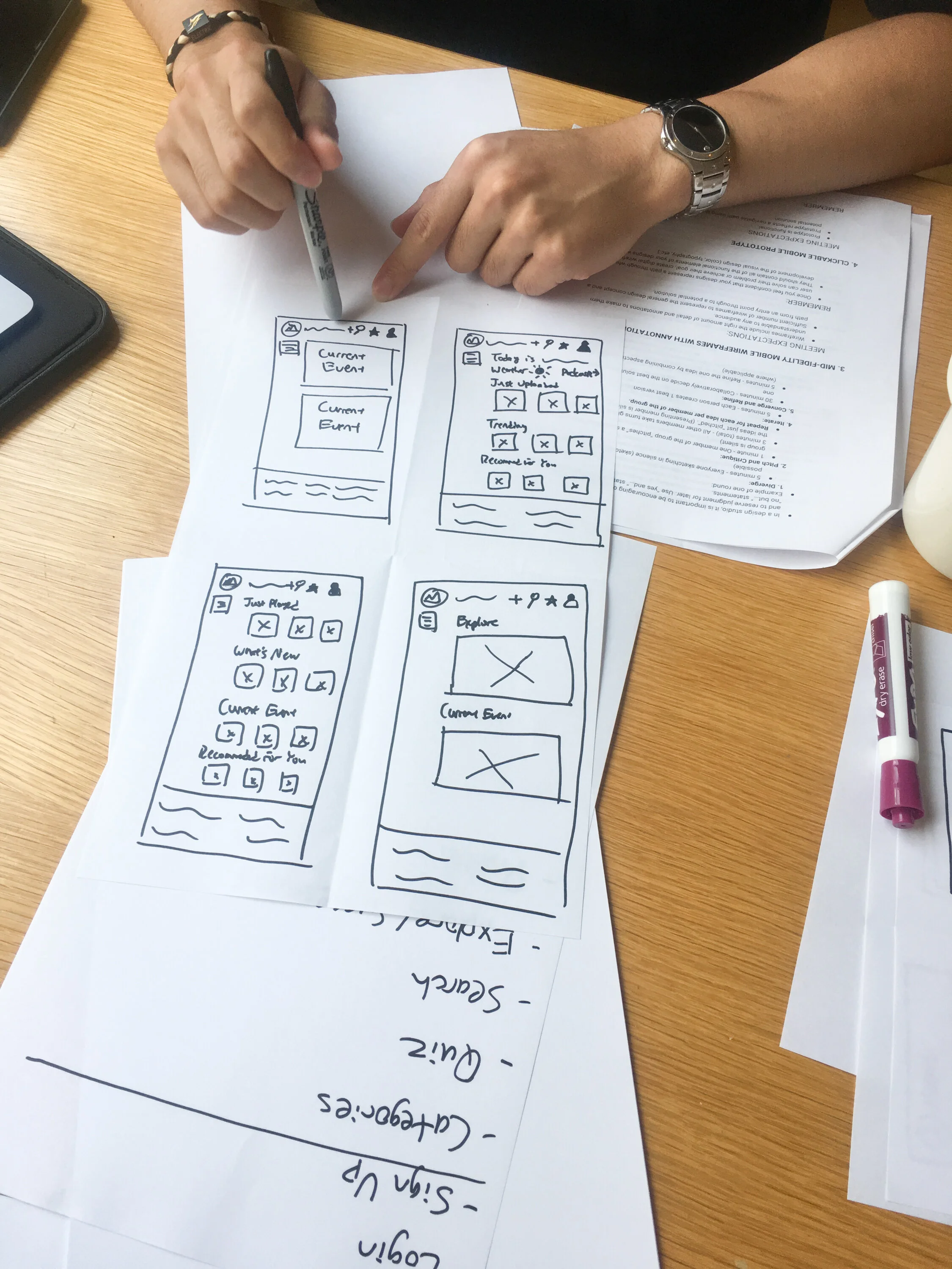
With key features identified, we conducted several rounds of paper sketching, which we then converted to low-fidelity whiteboard sketches.


Mid-Fidelity Mobile Sketch Wireframes and Prototype

Click to experience this mid-fidelity mobile prototype.
User flow task: Choosing a podcast based on user being in a ‘cerebral’ mood.
User selects the ‘Mood’ button to open up a list of mood options that the user can choose from.
User selects the mood option to open up a list of podcasts that are associated with the selected mood option.
User selects the podcast from the list.
User selects the play button to start the podcast.

Mid-fidelity vs. Hi-fidelity (Click above to explore the hi-fidelity mobile prototype.)
Insights & Improvements
In the mid-fidelity version (left) it wasn’t obvious that there was a comments section below the fold. With a redesign of the player tool we were able to create more space for the comments field and a down-arrow to indicate more information below.
Going from Mobile to Desktop
To fulfill our goal of having a responsive website, we adapted our mobile design for a desktop platform. All the same features are available with layout changes that take advantage of the additional screen real estate.
Navigation previously hidden in the hamburger menu moves to primary navigation.
Personal profile becomes visible.
Current events podcasts moved above the fold.
Click the image to explore the desktop prototype.
